Artwork
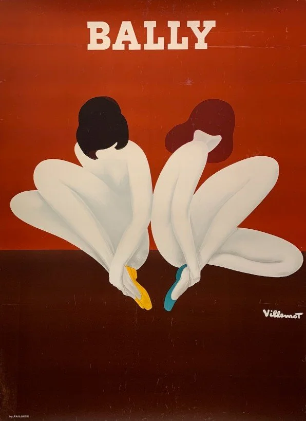
Bally 1973
Bernard Villemot
61 x 45 inches
Villemot has posed the two nude dancers to look like a lotus blossom. His study for this poster was, in fact, titled “Lotus” and on publication was quickly dubbed “Les Femmes-Fleurs.” The inspired choice of colors for the shoes, in an eerie coincidence, resembles the stockings in Socha's poster for the 1974 film "Moja Miłość" (see PAI-LXXII, 357). The bottom text panel has been eliminated in this specimen.
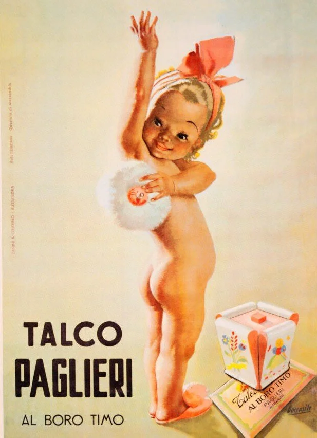
Talco Paglieri 1950
Gino Boccasile
13 x 19 inches
Advertising poster by Gino Boccasile for Paglieri, the Alessandria-based perfume and cosmetics company. Paglieri is especially known for its Felce Azzurra line and its talcum powders. This small-format design, attributed to around 1950, promotes Talco Paglieri “al boro timo”, showing a baby happily using the product. Issued as an offset lithograph and printed by Zannini & Cellerino, Alessandria.
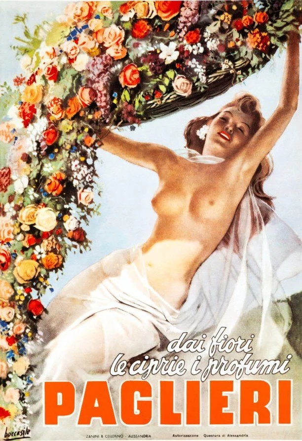
Paglieri c. 1950
Gino Boccasile
Original small-format advertising poster for Paglieri’s perfumed talc.
A Quiet Layer of the Room’s Story
As the design of the Lotus Room evolved, we found ourselves returning repeatedly to the original painted ceiling — a centuries-old composition of roses whose faded blush tones quietly established the emotional palette for the space. Rather than imposing a contemporary color story, we allowed the room to take its cues from what had already existed here for generations.
To complement the lotus narrative woven throughout the room — inspired by Lien’s name, which in Vietnamese means lotus flower — we wanted the space to possess a distinctly feminine sensibility without becoming literal or overly decorative. The curved velvet bed, warmer flooring, reflective chandelier light, and selected artworks were all chosen to contribute to this softer atmosphere.
The three vintage advertising works in the room became part of this conversation. Although created for different products, periods, and audiences, they share a common visual language: flowers, fragrance, softness, beauty, ritual, and the idealized elegance of European illustration.
Villemot’s Bally Lotus composition appealed to us for its extraordinary resemblance to a lotus blossom — an almost uncanny connection to the room’s central theme. Boccasile’s Talco Paglieri al Boro Timo introduces a quieter, more intimate register, connecting florals, personal care, and everyday ritual through the nostalgic lens of mid-century Italian advertising. The second Boccasile work, Paglieri c. 1950 (“dai fiori le ciprie i profumi” — from flowers, powders and perfumes), brings yet another layer: an elegant female figure enveloped by flowers, softness, and movement, rendered with a sensuality that feels refined rather than theatrical.
Taken together, the prints reinforce the room’s quieter themes — femininity, perfume, flowers, grace, and transformation — while subtly echoing details already present elsewhere in the space, from the rose ceiling to the chandelier’s shifting, water-like light. Like much of Palazzo Sapori, they were not chosen simply as decoration, but as small narrative fragments intended to be discovered gradually, with each guest noticing something slightly different.
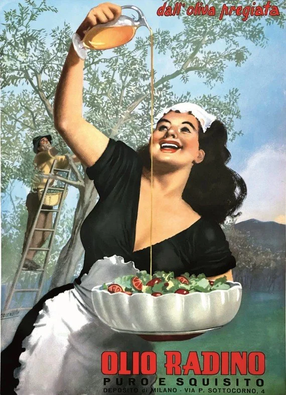
Olio Radino 1950
Gino Boccasile
39 ½ x 55 ½ inches
This charismatic original Italian advertising poster was printed in 1950. It is a design by renowned illustrator Gino Boccasile (1901-1952) a designer produced posters, illustrations, advertisements, and book covers known for their images of smiling cherubic children, lively colors, and sensuous renderings of the female form.
After the war, Boccasile became known for many posters and images including memorable advertisements for clients such as Paglieri cosmetics, Mimmi socks, Chlorodont toothpaste, Iperchina liquors, and Zenith footwear.
This image of a woman joyously pouring Radino oil over a salad remains an iconic image in Italy. Radino olive oil is still produced today, and Boccasile’s design adorns the label on bottles of oil produced by this premium brand.
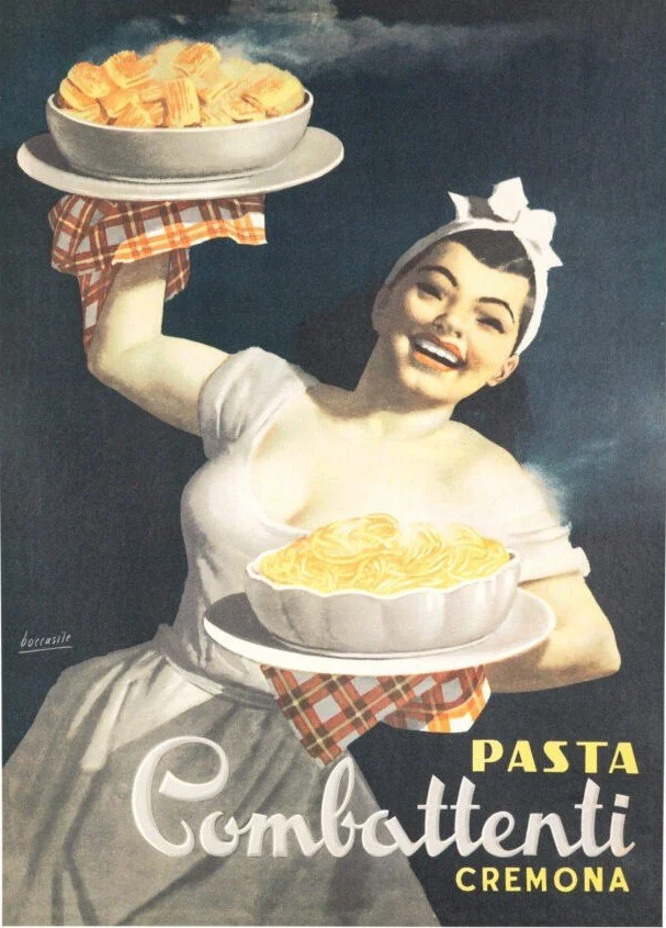
Pasta Combattenti Cremona 1950
Gino Boccasile
13 x 18.3 inches
Advertising poster by Gino Boccasile for Pasta Combattenti Cremona, issued around 1950. The design features a smiling woman carrying two bowls of pasta, in line with Boccasile’s postwar commercial work promoting Italian food and household products.
A Quiet Layer of the Room’s Story
The kitchen at Palazzo Sapori was never intended to function merely as a utilitarian space. In Italy — and particularly within older residences — the kitchen occupies a different role: part workshop, part gathering place, part stage for ritual, conversation, and daily life.
As the room evolved, we found ourselves drawn to imagery that celebrated not fine dining or luxury in the conventional sense, but the quieter poetry of ingredients, preparation, and domestic abundance. Olive oil, pasta, vegetables, shared meals — the familiar building blocks of Italian life elevated through illustration, memory, and atmosphere.
The two Boccasile works became part of this conversation. Olio Radino appealed to us for the way it compresses an entire agricultural narrative into a single image. Behind the central figure, olives are harvested from the tree; in the foreground, oil is poured generously over a simple bowl of lettuce and tomatoes. The muted greens, slate blues, and golden tones create a palette that feels remarkably at home in the residence. The woman herself — poised in gentle contrapposto, her skin glowing almost the color of the olive oil — embodies a kind of idealized postwar Italian archetype: industrious, elegant, domestic, and quietly heroic.
Pasta Combattenti Cremona continues this visual language through warmth, nourishment, and hospitality. Against a deep midnight-blue field, a smiling woman emerges in soft golden light carrying two steaming bowls of pasta wrapped in checked linens. The image is unapologetically generous — comforting rather than refined, abundant rather than restrained — and captures something deeply familiar within Italian culture: the idea that care, welcome, and identity are often expressed through food.
Taken together, the prints reinforce themes already present elsewhere in the kitchen — olive oil, pantry staples, shared meals, regional traditions, and the understated beauty of everyday rituals. Like much of Palazzo Sapori, they were selected not simply as nostalgic decoration, but as small cultural touchstones intended to deepen the room’s atmosphere and quietly connect guests to a recognizable yet increasingly disappearing vision of mid-century Italian domestic life.